Design system
Gallery

Building Components for Financial Complexity
When I joined Human Interest as their first designer, the challenge wasn’t just organizational—it was designing interfaces that could handle the complexity of financial data while serving three completely different user types. Plan administrators needed tools as sophisticated as Morningstar or Yahoo Finance, employees wanted simple retirement guidance, and operations teams required comprehensive dashboards for managing multiple lanes of 401(k) administration simultaneously.
The existing technical debt was crushing our velocity. Over 50% of engineering time was spent customizing outdated components to match evolving brand guidelines, while each audience struggled with fragmented experiences that created support burden and operational inefficiency.
The Fauxdal: Transforming Financial Paperwork
The most innovative solution I developed was the “fauxdal”—a full-screen interface with a centered modal and vertical progress indicator that transforms complex 401(k) paperwork into guided digital experiences. Similar to how DocuSign navigates PDF documents, but without ever showing actual forms until completion when all answers are automatically populated.
This pattern solved critical user problems: it reduced form abandonment by breaking overwhelming paperwork into digestible steps, ensured compliance documentation without intimidating legal text walls, enabled progressive disclosure where only relevant fields appeared, prevented errors through step-by-step validation, and built confidence by showing clear progress.
The fauxdal became essential for complex financial workflows where traditional forms would overwhelm users or create compliance risks through incomplete submissions.
Visual Foundation Adapted for Three Audiences
The foundational color palette uses bright accents against generous white space, but application varies dramatically by user sophistication. End-user tools emphasize whitespace and simplicity for retirement guidance, administrator tools balance accessibility with information density for compliance management, and internal operations tools adopt Bloomberg Terminal-style efficiency with maximum data visibility.
Typography centers on Inter for its exceptional performance with dense numerical data—critical for financial interfaces requiring tight table spacing, special financial glyphs, and legibility across screen sizes while maintaining approachability for non-technical users.
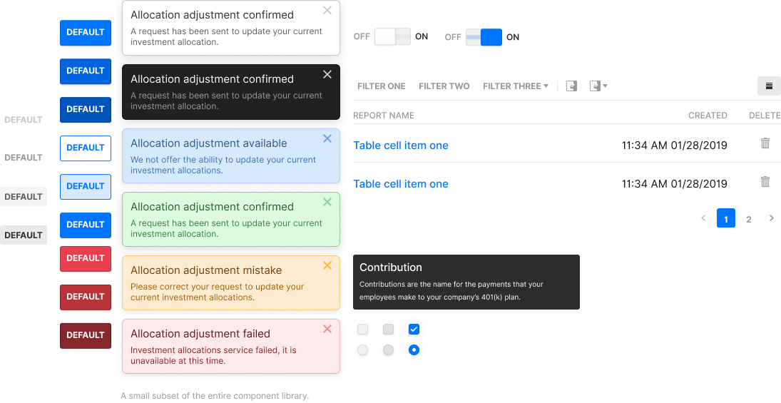
Components adapt in sophistication from simple employee contribution adjustments to sophisticated administrator compliance workflows, all sharing foundational design patterns but achieving completely different user experiences.
Custom Iconography for Financial Concepts
Standard icon libraries lack representations for complex 401(k) concepts, so I designed custom iconography for vesting schedules, employer matching, distribution types, and compliance requirements—financial concepts that needed visual representation but had no conventional symbols.
These custom icons became crucial for making complex financial information scannable and approachable, especially in employee-facing interfaces where users needed to understand concepts like “catch-up contributions” without financial expertise.
Testing Across User Types
Validation required different approaches for each audience. Internal tools were designed through observational research and analysis of existing tool metrics—I studied how operations teams actually worked to optimize their workflows. Administrator and end-user tools were tested with customer subsets and sales teams, with heavy emphasis on administrator experience since they made purchasing decisions.
This research revealed that the same information needed dramatically different presentations. Employees wanted retirement timeline visualization, administrators needed compliance reporting capabilities, and operations teams required comprehensive plan monitoring dashboards.
Architecture for Autonomous Implementation
The technical foundation used three abstraction levels designed for engineering autonomy. High-level components provided customization for common scenarios, mixins simplified complex styling rules, and variables managed typography, color, and spacing decisions across the entire ecosystem.
This enabled “eng design” JIRA tickets where engineers could implement solutions using established patterns with minimal designer guidance. Components prevented inconsistent implementation while preserving flexibility for legitimate customization needs across our diverse user base.
Building Design Infrastructure at Startup Velocity
The most challenging aspect wasn’t individual component design but managing the breadth of micro-interactions required across three distinct user types. Complex financial edge cases constantly demanded pattern modifications, and sometimes standardization created more complexity than bespoke solutions.
UI confusion support calls dropped by 90% as users found consistent patterns across all touchpoints. Engineering implementation time fell from 50% to 10%, allowing the development team to focus on feature innovation. The approach supported company growth from startup to growth stage without requiring proportional design team expansion.
The work gained external recognition when Brand New - Under Consideration featured our approach as an example of cohesive financial services design that balances sophistication with accessibility.
Domain-Specific Innovation Over Technical Sophistication
Building Foreground taught me that design systems require enormous effort to execute well, especially for complex domains like financial services. However, the domain-specific innovations—particularly the fauxdal approach and specialized iconography—proved essential for our specific challenges and became foundational to Human Interest’s product strategy.
The fauxdal pattern and custom financial iconography became company standards that enabled rapid feature development while maintaining user experience quality across vastly different sophistication levels, proving that domain-specific innovation often matters more than technical sophistication alone.