Rethinking mobile hardware interaction patterns
Gaming handhelds are exploding, cars are bringing back physical knobs. Meanwhile iOS 26 simulates depth and physics on flat glass while every app converges on identical patterns: bottom nav, 3-4 actions, one primary control.
If “People who are really serious about software should make their own hardware.” still holds true, my mockup would show how you might invent the next interaction paradigm.
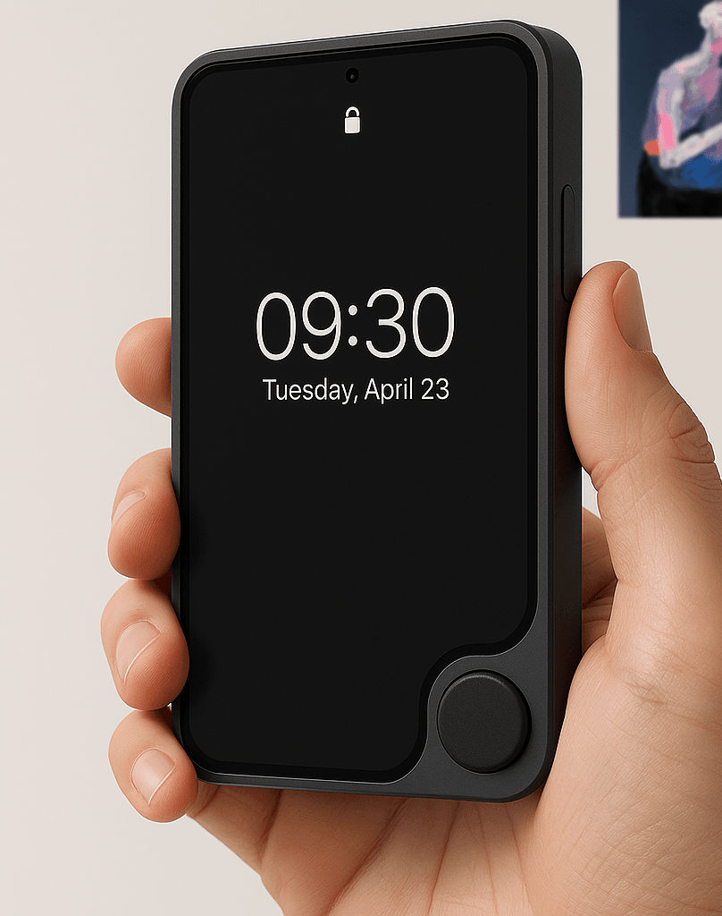
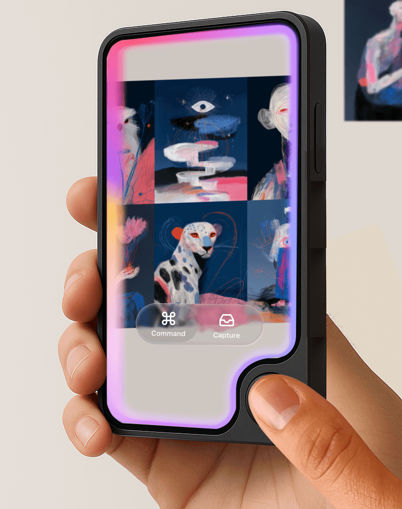
One pressure-sensitive nub that:
- Becomes your primary action (whatever the app needs)
- Provides actual texture for gesture control
- Gives precise navigation without covering the screen
- Press and hold and the camera passthrough with UI overlay opens a window to the world
That perimeter edge? Not decoration. It’s the boundary between digital and physical, and your finger is the bridge.
This is the iPod wheel for the spatial computing age.
Steam Deck sales proved we’ll carry bigger devices for better controls. Teenage Engineering gets it. Spotify Thing gets it. Even Apple gets it—why else make everything look so touchable?
Sometimes the best interface innovation is admitting that software patterns aren’t just design decisions, they’re hardware opportunities waiting to be built.
Home button is back, baby. Just this time, we’re stepping out rather than in.