December
19,
2023
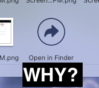
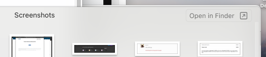
Why is the button to view a Stack in the Finder (making the content more easily searchable, sortable, scannable, etc.) the last item in the grid?
If it were the first item, at least then the user could easily decide between the stack view or the Finder view, but as the last item you’re always forced to scroll through the entire list (in some cases, a VERY long list).
Hell, even better? Put it as a floating object fixed to top of the panel.