Microsoft design team strikes again.
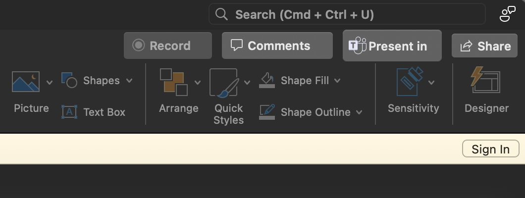
EDIT: Ah yes, but why?
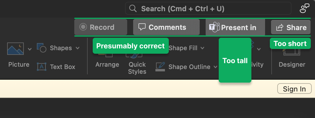
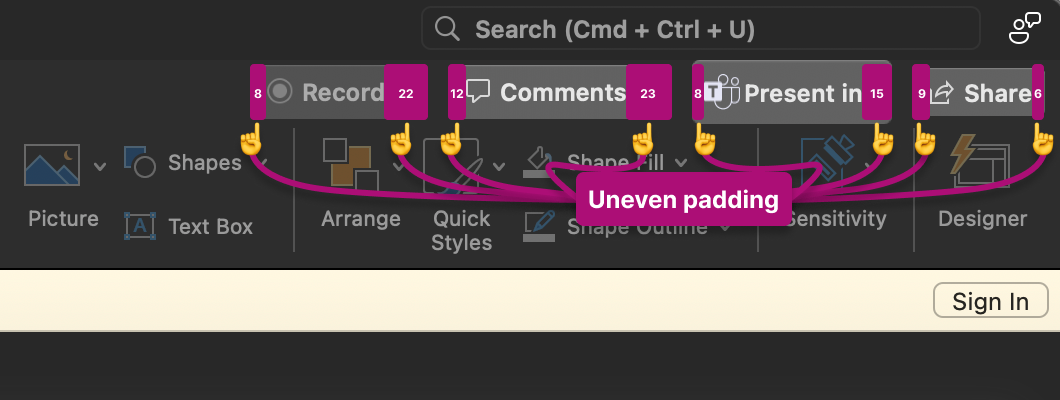
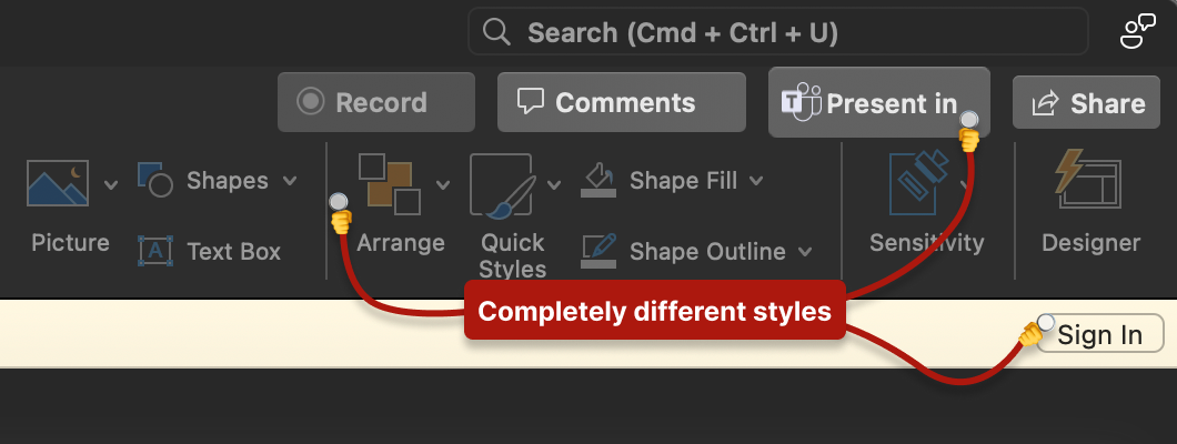
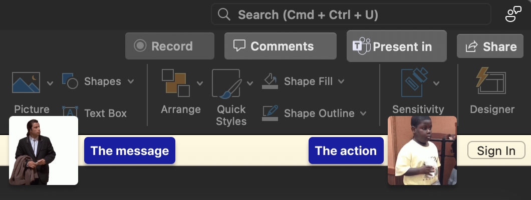
Microsoft design team strikes again.

EDIT: Ah yes, but why?


Finally got full interactivity working on the home page. Entirely coded using ChatGPT, figure that. 🤖
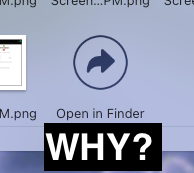
Why is the button to view a Stack in the Finder (making the content more easily searchable, sortable, scannable, etc.) the last item in the grid?
If it were the first item, at least then the user could easily decide between the stack view or the Finder view, but as the last item you’re always forced to scroll through the entire list (in some cases, a VERY long list).
Hell, even better? Put it as a floating object fixed to top of the panel.

Recently finished reading The State of UX in 2024: Enter late-stage UX, and had a few thoughts:
Automation
AI automates an increasing part of our jobs and reduces demand for designers in certain markets.
This evolution has been a long time in the making. Hard skills, traditionally deemed future-proof, are now facing challenges. The current opportunity lies in designers embracing AI-driven design generation to facilitate faster iterations and expedite the turnaround of concepts.
Saturation
Supply of designers outstrips demand. Market is still uncertain.
This was evident even in the early 2010s when the market was saturated with “designers” from bootcamps who made negligible contributions to the industry at large.
Commoditization
Focus on scalability and standardization over differentiation and delight.
Much like the industrialization of physical products, it is only logical that the next evolutionary step in digital design involves seeking ways to componentize and streamline the overall process. While there is still value in craftsmanship, (particularly when users anticipate a premium experience) the majority of products are utilitarian in nature and do not necessarily benefit from overly crafted experiences.
Financialization
Greater influence of financial health, shareholders interests, and business metrics in design decisions.
First and foremost you are a designer, not an artist; you are hired to solve business problems through design.
Disintegration
Lack of trust in digital products makes users either skeptical, complacent, or susceptible to exploitation.
An industry that heavily relied on dark patterns and manipulation to maintain user engagement results in a lack of trust? What a surprise.
I’m starting to think there are enough posts on this blog that I should implement some filtering at the head of the page.
Slingshot Design
Envision your design process as pulling back a slingshot, meticulously setting parameters and direction. Release the tension, propelling development swiftly toward the target with minor adjustments within the slingshot’s vectors.
Evaluate the impact:
One thing that I still haven’t seen touch interfaces properly provide affordance for are secondary actions. Yes, you can access them by typically a long-press, but how does a user know which items contain additional functionality?
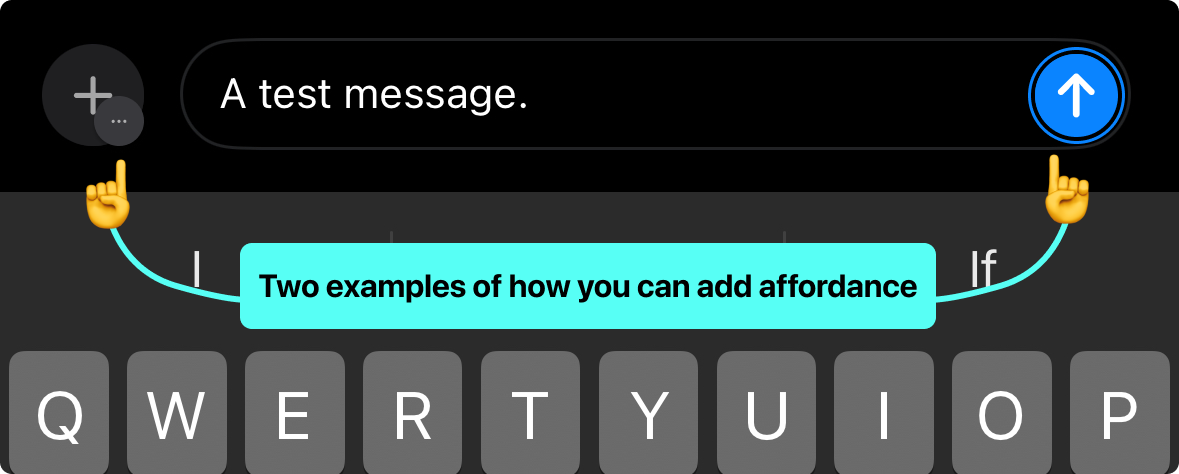
P.S. Onboarding modals or tooltips are a lazy excuse and if you thought that was an acceptable answer you are wrong.
Why the hell doesn’t the Apple TV Music app have a visualizer?